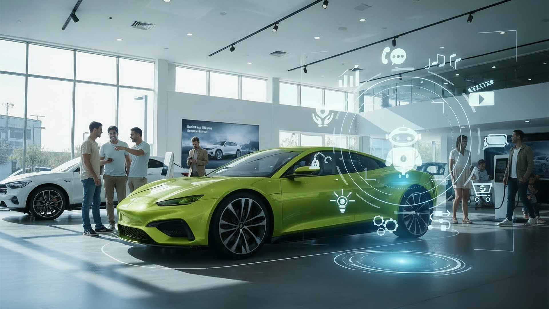
Building an AI Virtual Assistant isn’t just about code and algorithms—it’s about making technology feel natural, even human. That’s where Hussain Chassa, our Senior Product Design Lead, comes in. He’s the guy who makes sure our AI doesn’t just work but feels effortless to use. In this episode, he breaks down how thoughtful design turns complex AI into something people actually enjoy interacting with. From crafting smooth conversations to making sure users never feel lost, Hussain shares what it really takes to bring an AI assistant to life.
Part 1: UI/UX Design Fundamentals
What were the primary considerations in crafting Seezar’s user interface to ensure it is both intuitive and visually engaging?
When designing Seezar, we focused on several key principles to create an intuitive and engaging interface. First, we made the interface minimal and clean by simplifying all components, allowing users to focus entirely on their conversation with Seezar without distractions. This was a significant shift from traditional dashboards that often display too much information at once. Second, we designed Seezar with an option to take up the full screen, creating an immersive experience where users can freely ask questions, receive answers and compare cars on a larger window. This departure from conventional chatbots, which are usually confined to small windows, helps users feel more engaged with the conversation.
Third, we paid special attention to text formatting and spacing, ensuring clear communication while maintaining visual appeal. The components are intentionally simplified to highlight the most important information first, with the ability to request more details as needed. Finally, we streamlined the interface by keeping all interactions within a single chat window. Users can simply ask questions and get instant answers without navigating multiple pages, making information more accessible and engaging.
What are the core design principles behind creating an effective and simpler AI virtual assistant compared to the traditional chatbot?
We completely reimagined design principles for Seezar, moving beyond traditional dashboards that hide information behind menus. Our integrated, transparent approach emphasizes clear communication, especially for error handling. Instead of using pop-ups or notification bars, Seezar communicates issues directly in the chat, creating a more natural experience.
We also prioritized showing users exactly what Seezar is doing at each step of their interaction. Whether it’s fetching images, comparing cars, or searching inventory, users can see the thought process behind Seezar’s actions. This transparency helps build confidence and trust in the system. Finally, we designed Seezar to be highly adaptable to different dealership websites. Unlike standalone chatbots such as ChatGPT, Seezar needed to feel like a natural extension of each dealer’s website. We achieved this by creating a minimal, customizable interface that can take on the branding of any dealership while maintaining its core functionality. This approach ensures Seezar feels like an integral part of each website rather than a separate tool.
Part 2: Branding & Visual Elements
What was the inspiration behind the Seezar logo? Or how did you come up with it?
The Seezar logo design was inspired by several key elements from our company’s history and vision. First, it maintains continuity with our existing Seez product family (like SeezPad and SeezClick) while marking our transition into the AI space. The name “Seezar” itself pays homage to our first AI chatbot “Seez-r” that we had previously developed for negotiating with dealers.
For the visual design, we chose green as our primary color because of its psychological association with trust and openness. We drew inspiration from WhatsApp’s familiar and welcoming presence, but made our design more vibrant to reflect our cutting-edge technology. The logo incorporates wave forms, which hint at an upcoming voice feature for Seezar. The overall design aims to make Seezar feel familiar and approachable, like having a conversation with a trusted friend. We also incorporated elements from Roman colors and its hierarchies, which will play a role in future plans for Seezar’s development.
Part 3: Adaptability & Implementation
How do you approach making Seezar’s design adaptable for different dealership needs and preferences while ensuring the UI remains consistent across various platforms (web, mobile, in-showroom screens, etc.)?
Our approach to making Seezar adaptable prioritizes simplicity. We’ve streamlined customization to focus on one primary color choice, similar to iPhone and Android’s color systems. When a dealer selects their brand color, Seezar automatically adjusts all design elements to maintain visual consistency while matching the dealer’s identity.
We also adapt Seezar’s visual style to match each dealer’s website aesthetics. The interface automatically adjusts elements like chat bubbles and input fields to match the dealer’s design preferences. Our responsive design system ensures a consistent experience across all devices – from desktop browsers to mobile phones and in-showroom displays. The interface smoothly adapts to different screen sizes while maintaining optimal performance and loading times, delivering a seamless experience whether customers are browsing on their phones or at a dealership kiosk.
What design challenges have you encountered during the development of Seezar and its UI/UX?
During Seezar’s development, we faced several key design challenges. The first was creating a robust color system that ensures text remains readable regardless of the dealer’s chosen color scheme. In order to resolve this our system automatically adjusts opacity and text colors to maintain readability and accessibility. The second challenge was designing responsive interface components that work seamlessly across all screen sizes, from full-screen displays to mobile devices. We created specific components that display essential information (like car model and price) upfront, with additional details available through further interaction.
We also had to carefully balance when to display interactive components versus simple text responses, finding the right mix through extensive testing. Another challenge was meeting different user needs – dealers typically want to display comprehensive information, while end users prefer a simpler, more focused experience that helps them accomplish their goals quickly. This required careful consideration and user testing in our design process to ensure we weren’t overwhelming users with unnecessary information that could distract from their primary objectives.
Finally, we maintained strict accessibility standards throughout, ensuring properly labeled elements, appropriate color contrasts, and screen reader compatibility, while keeping the interface engaging and visually appealing.
Where do you see the differences usually between a dealership’s requests vs what a user might actually need when interacting with Seezar?
The key difference lies in familiarity – dealers use Seezar daily and know all features, while users are often first-time visitors needing intuitive guidance. Our challenge is balancing these different needs effectively. Through extensive user testing and feedback collection, we understand how new users interact with Seezar. We carefully evaluate dealer suggestions while ensuring the interface remains user-friendly. Our design process involves prototyping and A/B testing to validate features that work for both parties.
For instance, while dealers prefer comprehensive vehicle information displays, users want simpler presentations highlighting key features. Our solution is a layered approach – essential information appears first, with expandable details available when needed. Similarly, we’ve balanced communication style between dealers’ preferred professional tone and users’ preference for conversational interaction, making Seezar both professional and approachable.
What are some key UX mistakes in chatbot design that can lead to poor user experience?
Based on our experience with Seezar, we’ve identified several common UX mistakes in chatbot design: First, requiring users to type out long messages when they could simply select from pre-generated options. We learned that users prefer quick, suggested responses rather than having to type everything manually. That’s why we’re developing smart suggestions and quick replies to make interactions more efficient.
Second, being too intrusive with animations and automatic pop-up messages. Initially, we included many interactive elements that would appear as soon as users landed on the page. However, feedback showed that users prefer a more subtle approach where the chatbot is available when needed but not constantly demanding attention.
Third, failing to find the right balance between being proactive and passive. Some dealers wanted Seezar to be more prominent, while others preferred it to be more subtle. The key is finding the sweet spot where the chatbot is helpful without being overwhelming. We’ve learned to view these challenges not as mistakes but as opportunities for improvement. Through continuous testing and user feedback, we keep refining Seezar’s design to create a better user experience.
Part 4: Maintaining Balance and Staying Ahead
Some chatbots use emojis, humor, and casual language—where do you draw the line between friendly vs. unprofessional?
With Seezar, we’ve learned that finding the right balance between being friendly and professional is crucial. When we first launched, we used more emojis and casual language, but we’ve since refined our approach. We discovered that the key is to prioritize clear information first, then add personality in appropriate places. We approach this balance by following a simple rule: establish trust through competence before showing personality. For example, Seezar will first provide accurate information about a vehicle or answer a user’s question directly. Only after delivering value will it incorporate friendly elements like carefully chosen emojis or light humor.
This approach helps maintain professionalism while still making interactions engaging and approachable. We’ve found that users respond better to a chatbot that knows when to be business-like and when it’s appropriate to be more casual. The goal is to make users feel comfortable while ensuring they take Seezar seriously as a reliable tool for their car-buying journey.
From a design perspective, how do you ensure that Seezar’s design and development practices remain current, effective, and stay ahead of the trends? Do you have any recommendations?
To keep Seezar’s design current and effective, we conduct research on existing products, particularly studying platforms like ChatGPT that break conventional design patterns. We maintain a library of chatbot screenshots, analyzing their unique features. Our design process involves creating two versions of each design – one experimental and one safer, i.e., that would work as intended. Through team discussions, we merge innovative elements from the experimental version into the safer one, allowing us to evolve while maintaining user familiarity. Our hands-on approach to learning through doing, combined with constant iteration and user testing, helps us stay ahead of trends while ensuring effectiveness. We closely monitor user interactions with new features, using these insights to refine our approach rather than just following trends.
We stay connected with the design community on various platforms, drawing inspiration from new prototypes. This engagement helps us adapt fresh ideas for Seezar. We believe in learning by doing—often, pushing boundaries means starting to design and refining as we go. Regular user testing helps us ensure our innovations enhance the user experience rather than following trends for their own sake. We also emphasize staying technologically current. Our team participates in workshops, conferences, AI, and design communities to stay updated with the latest UI/UX trends. This knowledge is carefully filtered to focus on what benefits our users, avoiding trends that lack practical value.
Hussain’s final ‘brake’ down:
As we conclude our discussion on Seezar’s design journey, I want to emphasize that successful AI assistant design isn’t just about technical capabilities—it’s about creating meaningful, intuitive interactions that truly serve our users’ needs.
Looking ahead, we’re excited about upcoming innovations like voice features and more sophisticated personalization options. Our adaptive design system will continue evolving to meet changing user expectations while maintaining the crucial balance between professionalism and approachability.


